Wilson’s Wave
Wilson’s Wave, named after Wilson Moore, is a nonprofit organization founded to educate and provide resources to the public about the dangers of fentanyl poisonings and counterfeit pills. It was an honor to work with Wilson’s mother, Betsy Moore, to create a visual brand for such a vital cause: keeping Wilson’s memory alive and spreading information to prevent others from experiencing the same heartbreak.
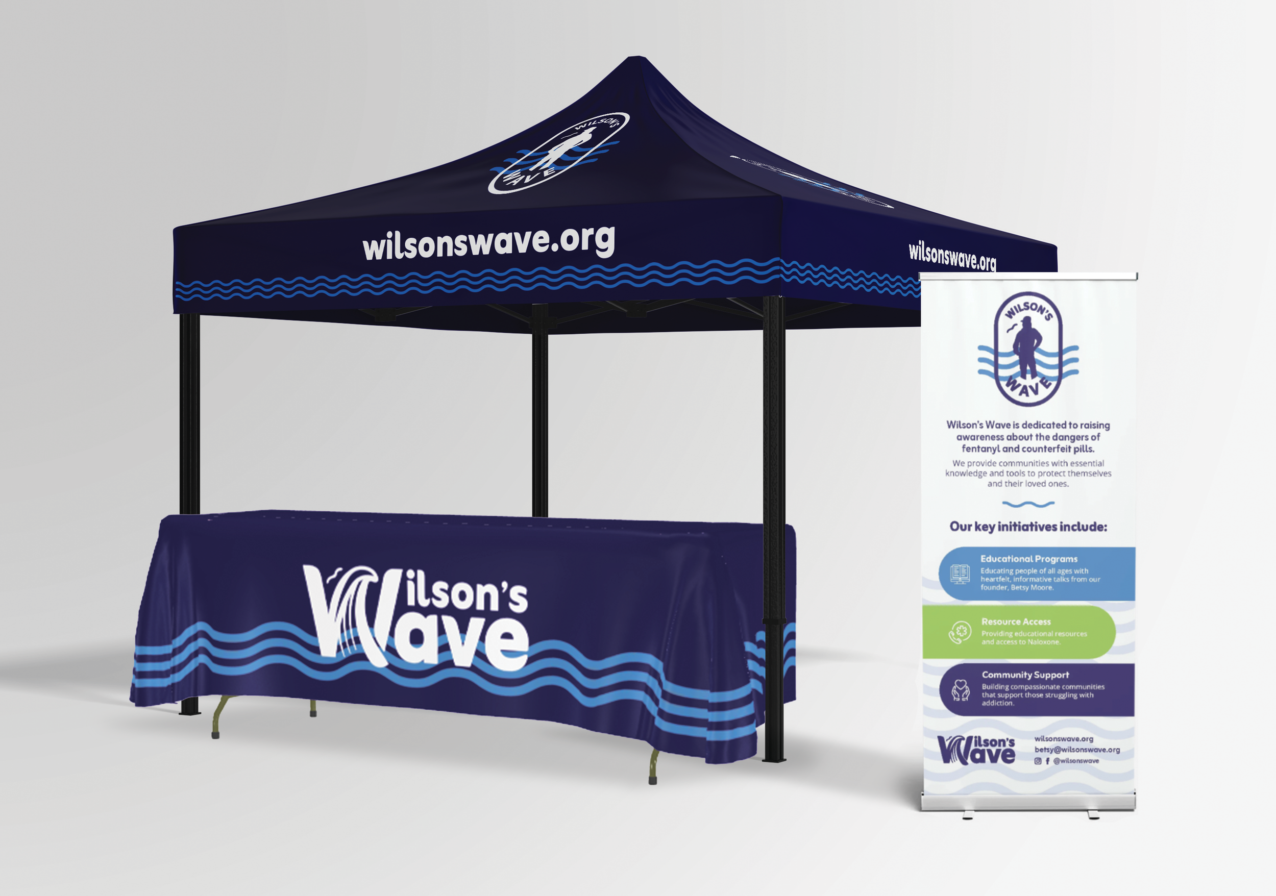
The Goal: Build a brand memorializing Wilson—including his love of all things camo, trucker hats, and ECU—and the effect he had on those he loved who knew him in life. Incorporate wave/water/ripple imagery, as well as purple (the color for fentanyl awareness).
The Solution: Adding a wave into the “W” and creating a secondary logo that centers Wilson’s silhouette, as well as a ripple motif that could be expanded into a pattern. The main idea behind this branding is the “ripple effect”— how small actions spread outward, making waves of change through a community. The bird, included in all versions of the logo, symbolizes spirit, protection, and care.
Collaboration with Rachel Cameron (Booth Design and Merch) and Amanda Mcquade (Color Scheme)
PROJECT SCOPE:
Branding
Website
Merchandise
Booth Design


COLOR
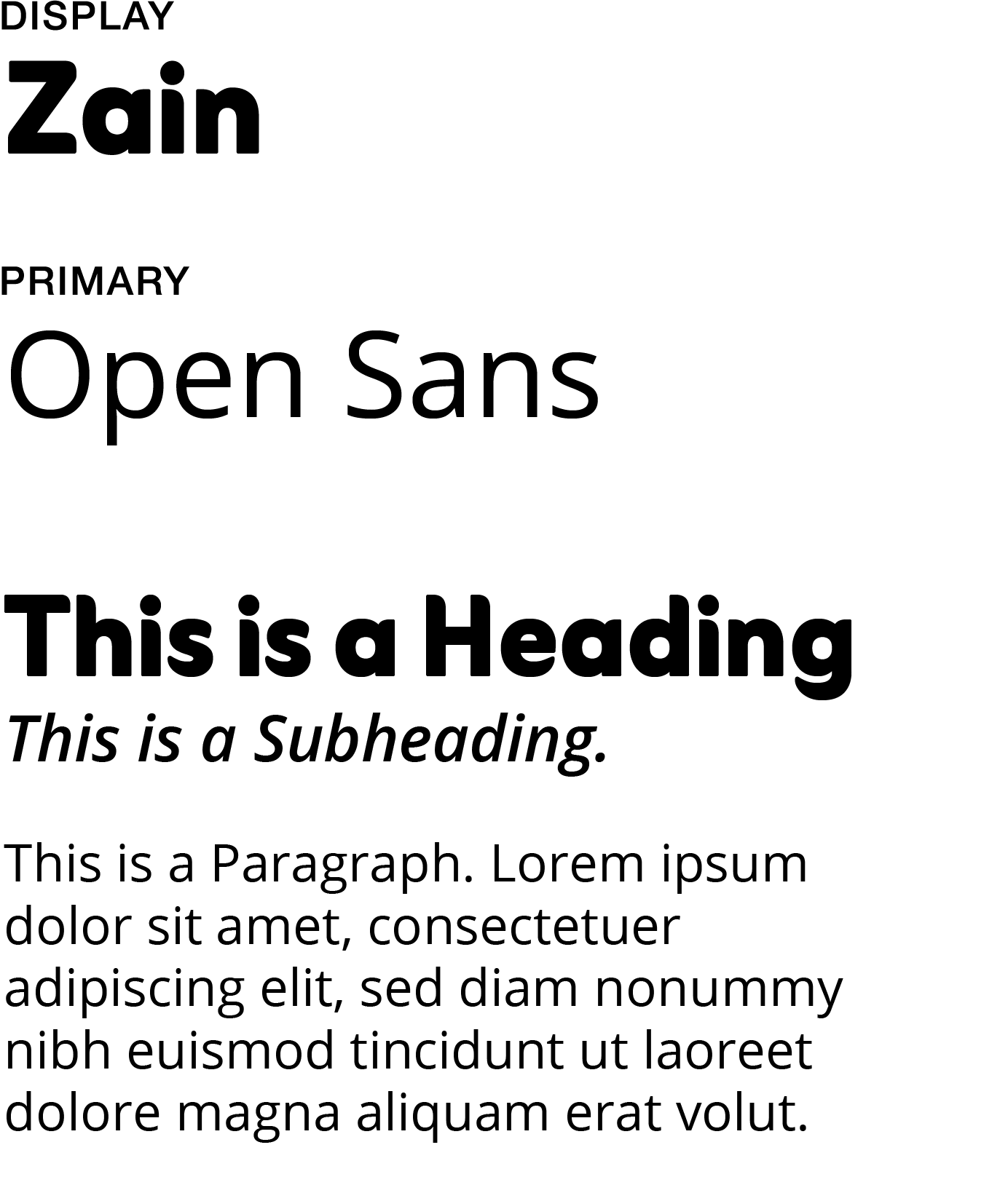
TYPEFACES
LOGO VARIATIONS

Website
Merch

Booth Design